Blog Post
Take 2… Action!
 Last week we looked at how it’s very very important to have a clear call to action (CTA) on your site. To recap, you need to have a way to encourage your visitors to take action while on your site: buying your product, filling out your contact form, or whatever the first domino is to converting them into a sale.
This week, we showcase two basic styles and some concrete examples of effective CTAs. Yay, pictures!
1. Simple Buttons
If something looks clickable, users are more inclined to click on it. Our first example comes straight from our own header:
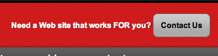
This is a link like any other, but it’s been styled to stand out. The subtle background gradient gives it a 3-dimensional appearance, and the rounded corners contribute to the button-like feel. It all combines to suggest that you can (and should) click on it.
It’s also positioned at the very top of the page, giving it visual priority.
MailChimp is another site that features a big, simple button as their CTA. This section dominates the right side of the home page:

2. Short Forms
Another effective CTA is to include a short form on your home page. Nothing too complex (this will discourage users from taking the time to fill it out), but short and sweet. A good example of this is the Progressive site.
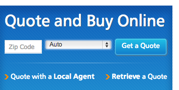
Enter your zip code, select which type of insurance you’re interested in, and you’re off to the races. This is followed by a longer form, but if you’ve gotten to that point, the CTA’s mission is accomplished. Note the big headline, and again, the button that looks like it should be clicked.
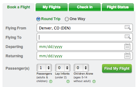
FlyFrontier.com has a more complex form, but still nothing too elaborate. This guy is front and center on the home page.
The examples above all have a few things in common.
- big
- stand out from background
- look clickable
This is all part of what’s called Information Architecture – essentially, making the most important thing on the page stand out. Newspapers do this all the time with their big bold headlines on the front page, engineered to pique your interest and make you pick up the paper and keep reading.
What are your goals for your site? What one thing, above all others, would you like your visitors to do? Spend some time defining that, and then you’ll be ready to look at incorporating a CTA of your own.
Photo Credit: bogenfreund via Compfight cc